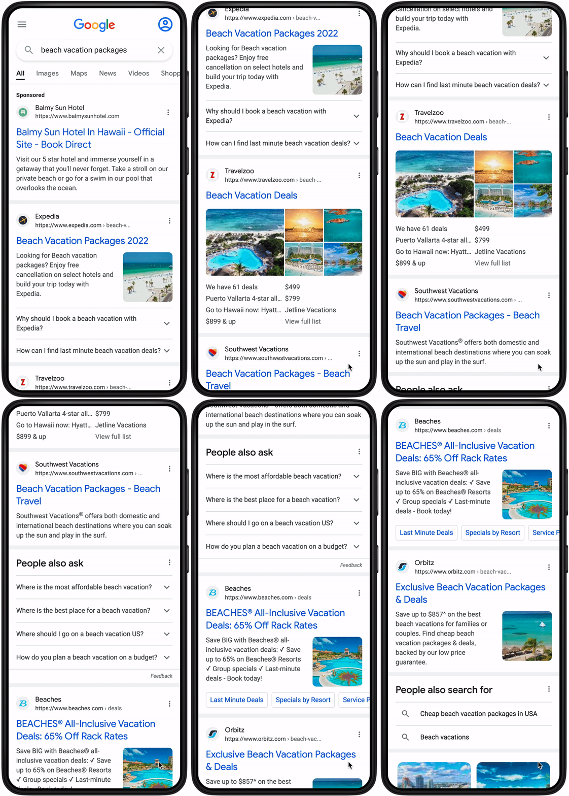
People come to Google to find information from a wide range of sources and formats, from big brands to individual creators, across text, images and video. As we’ve introduced features and design elements to help you explore information in new ways, we’ve also continued to bring greater context to the search results page, helping you make sense of the information you see. Today, we’re making a few new updates to the search page that build on this work, providing even more information about the sites that you see so you can feel confident about the websites you visit.
We’re adding site names to search results on mobile, so you can easily identify the website that’s associated with each result at a glance. We’re also updating the size and shape of the favicon (a website’s logo or icon) that appears in Search, to make it easier to see on the page. We’ll extend these changes to Search ads to increase clarity and advertiser transparency at a glance.

Part of helping you make sense of the information you see is ensuring that ads are clearly labeled, which is why our label will now be featured on its own line in the top-left corner of Search ads. We also want the label to be prominent and clear across different types of paid content. That’s why when ads show on mobile search results, they will now be labeled with the word “Sponsored” in bold black text. This new label and its prominent position continues to meet our high standards for being distinguishable from search results and builds on our existing efforts to make information about paid content clear.
This search page update is starting to gradually roll out on mobile and we’ll soon begin testing a similar experience on desktop, helping people more easily find what they’re looking for, no matter where they’re searching.
